I often like the back of stitched artworks as much as I like the front, or, sometimes, even more. There is something appealing about the rawness, the loose threads, the visible markings of the artist’s hand, the messiness… For the same reasons, perhaps, I also love exposed seams. If you looked through my closet, you’d find several tops and dresses with seams on the outside. These items feel different, more special somehow.
My quilts, however, rarely have seams, as I don’t usually piece fabrics together. I mostly work with thick home decor textiles that don’t respond well to piecing. My go-to technique, therefore, is raw-edge applique. A rare exception is my quilt Blue Planet Blues, which I made several years ago. In that quilt, I created texture and rawness by using outside seams. The subject matter demanded imperfection, a touch of ugliness and fraying, and raised seams conveyed those. At the time, I was happy with the finished effect and resolved to experiment with the technique further. Somehow, though, I never got to it. Until a year or two ago, that is, when I picked up a couple of rectangle blue fabric swatches with different textures, and began playing around. I cut them up in an angle, combined two different fabrics together, and hand stitched along the edge, using embroidery floss and blanket stitches. I found it hard to hold the pieces together as I stitched along. It took longer than I expected, and the resulting seam was less visibly striking than I expected it to be. The disappointing result didn’t justify the time and effort, and so I set the few pieces I already stitched aside and forgot all about them.
A few months ago I attempted, once more, to clean up my sewing room. I stumbled upon the abandoned pieces in one of my piles, and decided to give them another chance right then and there. This time, I didn’t even try hand stitching. Instead, I took additional fabric swatches straight to my machine. The machine-stitched pieces looked a bit different than the ones I stitched by hand, but I had to look at them very closely to even notice the difference. In other words–the machine stitched seams were good enough, and were also significantly more pleasant to create…
Blue Inside Out
After I sewed several rectangles, I had to decide what final size I wanted the piece to be. Because this was an experiment (and an iffy one at that!) I eventually chose to go small. I settled on 14″ x 18,” and began arranging a composition. The blue rectangles, with their different textures, were fun, but when I put them all together they somehow lacked a spark. I tried adding different colors, and eventually chose to insert one splash of golden yellow, as I did in the Flow and Contrasts series. That seemed to do it.
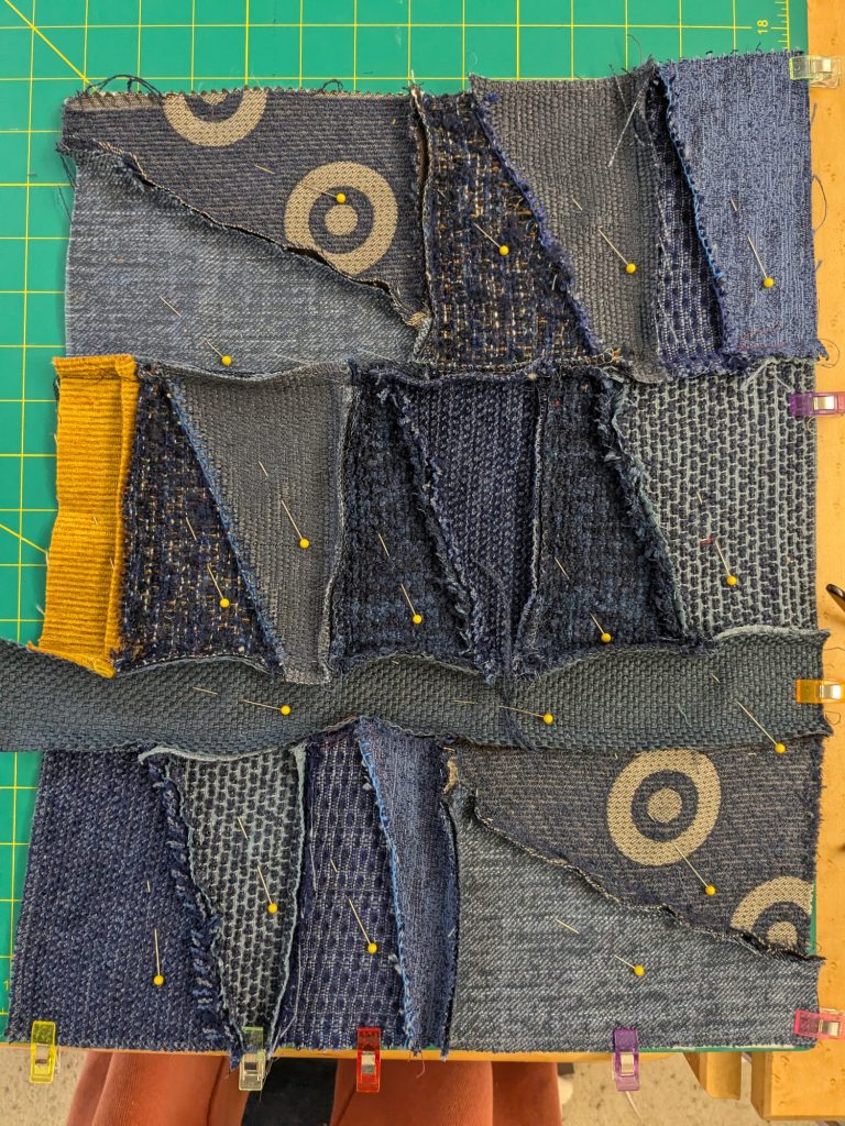
Once all the different pieces were sewn together, I stitched a black border all around. I added batting, and hand stitched along the edges of the various patches. For this, I used many different shades of red embroidery floss. I wanted these stitches to pop out, and also thought it would be fun to include all three primary colors.

These stitches added the extra benefit of giving my rectangles a stronger structural support, thus making the seams more pronounced.

Once all the stitching was complete, I stretched the quilt over a canvas, which made it look more like a piece of art.
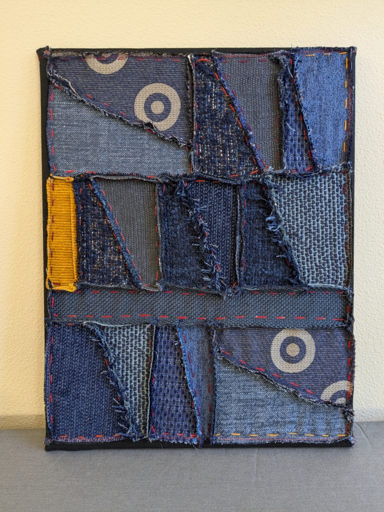
I couldn’t decide whether Blue Inside Out was a huge success or a total failure. It was definitely different, somewhat quirky, and pretty in an ugly way. The longer I looked at it, though, the more I liked it! Of course, I had to keep experimenting…
Teal Inside Out
I turned to my teal fabrics next, because I had a lot of them and they were really beautiful. This time, I inserted a red contrast, and used shades of yellow embroidery thread for the hand stitching part.
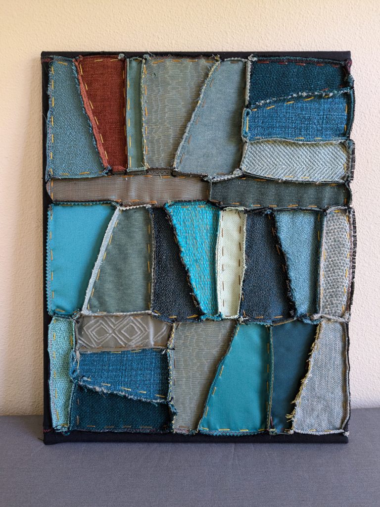
By the time Teal Inside Out was done, I was hooked. I couldn’t wait to try more colors.
Red and Yellow Inside Out
It took a few more months until I found the time to continue the series. I tend to work on lots of different projects at a time, and there’s always life happening as well. But I did get to it eventually.
The primary-color color scheme dictated my following fabric choices. Red Inside Out, which came next, made me happy every time I sat down to stitch it. Its rich, warm terracotta/rust reds and yellow pop out, along with the gorgeous textures of the upholstery textiles, were a pleasure to look at and touch.

I think the blue thread added an extra pop, too.
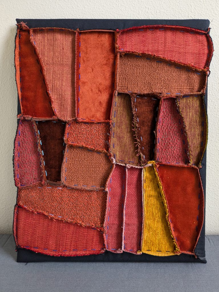
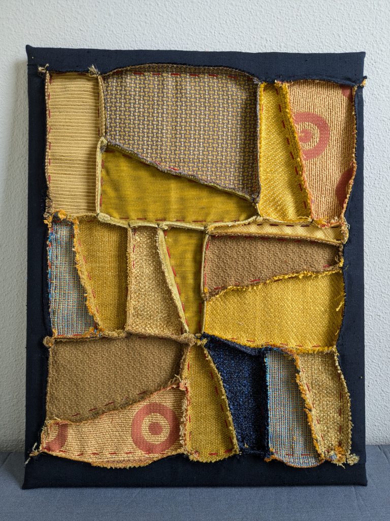
Last but not least came Yellow Inside Out. For this piece, I used different shades of warm ochre/mustard-yellow fabrics.
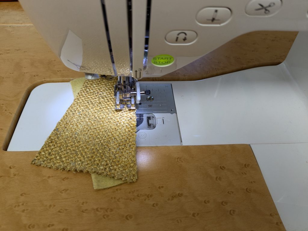
I contrasted the yellow with one piece of dark navy blue.
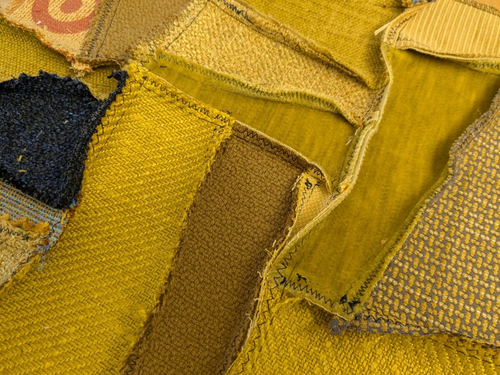
I must admit that the back of the piece was nice, too, if very different.
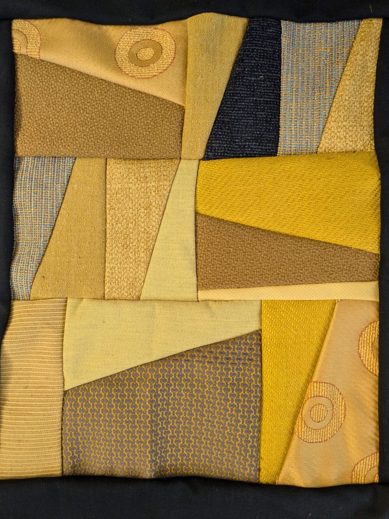
For the hand stitches in this piece I used red, of course, in many different shades.

The final piece:
As usual, I like seeing all four pieces together:

The Inside Out series is mostly about texture, but color plays an important role, too. The reversed seams somehow enhance the weave of each of the individual textiles included, and add a bold 3D effect. The protruding seams also make the interplay of light and shadow an integral part of the art.
I know these pieces aren’t everyone’s cup of tea. I had to get used to them myself. But once I did, they really grew out on me. Now I’m wondering where I can take this next, maybe by trying different colors and scales…
******
I am thrilled that Blue, Red and Yellow Inside Out were chosen by curator Leah Andrew to be a part of the 55th Annual Textile Exhibition at the Olive Hyde Art Gallery in Fremont, CA. That show, which is always fabulous, will run from June 12 to August 2, 2025. If you find yourself in the SF Bay Area this summer, make sure to stop by and see them in person!
Love you color and texture combos. These are beautiful!
Thank you!!
fine!
thanks
Exotic! Well done. I’d love yo see more. Best wishes for your upcoming exhibition.
Hugs
Thank you!
This is a beautiful and intriguing series. Thanks for sharing.
Thank you!